How-to: Prepare a word for book folding with Inkscape
| | By Moini | Category: Paper | 0 Comments
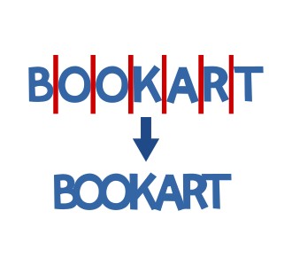
Sometimes, the book art generator complains about vertical gaps between parts of your image. This is usually the case with text (names, meaningful words) that hasn’t been prepared for use as book folding pattern, because most non-handwriting fonts have gaps between the letters.
In this article you will learn how to get rid of the gaps, and of the warning message, by using a free graphics software for creating the image of the text that should go on your book.
The problem
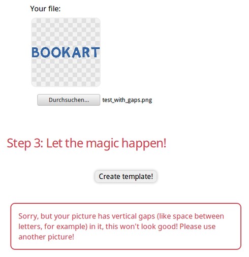
Gaps that go from top to bottom through an image that you want to put on a book as a book folding pattern are likely to make the result of your work look ugly, because those pages will not be folded back at all, and stand out as vertical bars between the letters, and those blend together with the letters and hurt legibility.
One possible solution to the problem would be to fold those pages between the actual letters back, so they don’t stand out, but that has two major drawbacks:
- wasting valuable space that could rather be used to make the word larger
- losing some of the beauty that lies in the soft waves on the upper and under side of the book, that are caused by the angled folding of the pages
The solution
Using the free, libre and open source vector graphics editor Inkscape and the Bookart Generator on this web site, you can easily create word art that plays well with book folding and will look great on someone’s shelf!
Step #1: Get Inkscape

Visit the Inkscape website and download the latest version for your operating system. If you need help installing, take a peek into the installation guides for Mac and Windows. On Linux, use your package manager to install Inkscape, or, if you’re on an Ubuntu-based distro, use the ppa to get the latest stable version.
If you’re wondering why I’m suggesting to use Inkscape: It’s because I’m part of the team that works on making it. I don’t have the skills to write code for it, but I organize website translations, help with translating Inkscape and its website to German, give user and community support, do testing, sometimes help with sorting through bug reports or write and improve documentation.
Also I think it’s a great software to use for this purpose, as it really only involves clicking on the canvas, typing, and using a key combination to move letters closer to each other.
Step #2: Launch Inkscape
If you’re using an older Inkscape version, the first launch may take some time, because Inkscape is examining all your fonts before the first start. Version 0.92.3 should start up a lot faster than previous versions. If you’re on a Mac, and Inkscape doesn’t start at all, please see this item in the Inkscape FAQ.
Step #3: Type your text
This is really easy:
- Select the text tool from the tool box on the left of the Inkscape window
- Click on the canvas
- Type your text
📹 Watch a video for steps 3 to 6
Step #4: Select a font
Now you can select a nice font from the dropdown list at the top. One with huge, thick letters is better than a very thin and elegant font for the purpose of book folding.
If you’re using a very thin font, and want to make the letters bolder, first see if there is a bold variant of the font available (use the second drop down menu in the text tool’s tool bar at the top for this).
How to make a text bold when no bold variant of the font exists:
If there isn’t a bold variant available, you can instead add a thin stroke (a drawn border) to the letters, in the same color as the letter itself.
To do so, hold Shift and click on the color you need in the palette at the bottom. This will give you a stroke around each letter.
To change the stroke’s width, right-click on the tiny number in the bottom left corner, right behind the lower color indicator field that indicates the stroke color, and select a different number there.
If you need more fine-grained control over the stroke width, you can also open the Fill and Stroke dialog by going through the menu Object > Fill and Stroke, switch to the dialog’s third tab, and change the width of the stroke numerically.
Step #5: Move letters closer to each other
This is the step that will get rid of the gaps between the letters.
- Make sure you’re using the text tool again.
- Now move the mouse cursor over the word, between the first two letters, until it looks like a text cursor (a vertical bar).
- Click.
- Hold the
Altkey, and use the arrow key that points to the left to move the second letter of your word closer to the first one. - Let go of the
Altkey, and use the arrow key that points to the right to get to the next space between two letters. - Repeat steps 4. and 5. until all letters touch their neighbouring letters.
Step #6: Add top and bottom margins
In this step, we’re going to add a margin to your word, so it will not touch the top and bottom of the book pages. Optionally, you can also add a margin on the left and right.
- Select the Rectangle tool by clicking on the little square-shaped tool icon on the left of the screen.
- Use it to make a rectangle that is a bit higher and maybe also a bit wider than your word by clicking-and-dragging on the canvas.
- Now the rectangle covers the word, but that is not a problem. Keep it selected (i.e. do not click anywhere else) and press the PgDwn key.
- Now change the rectangle’s color to a very light grey, by clicking on the light grey color patch in the palette at the bottom of the window.
Step #7: Centering
Now we need to center the word on the light grey rectangle. For this:
- Click to use the Selection tool. This is the top most tool icon. It looks like a mouse cursor (an arrow).
- Hold the
Shiftkey and click on the rectangle and on the text to select them both. You will see that they are selected, when each of them has a thin dashed border. - Open the dialog for aligning objects with
Object > Align and Distribute. - In the dialog, make sure that the button marked with
1in the screenshot is inactive, then click on the buttons for centering vertically and horizontally. The order does not matter.
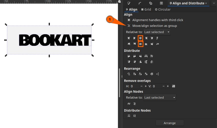
Imagine that this will be the final image, how it looks when the book is fanned open. If you are happy with how it looks now, proceed. Else, click on the rectangle with the Selection tool, and use the arrows to change the rectangle’s size and then do the centering again.
Step #8: Export a PNG image
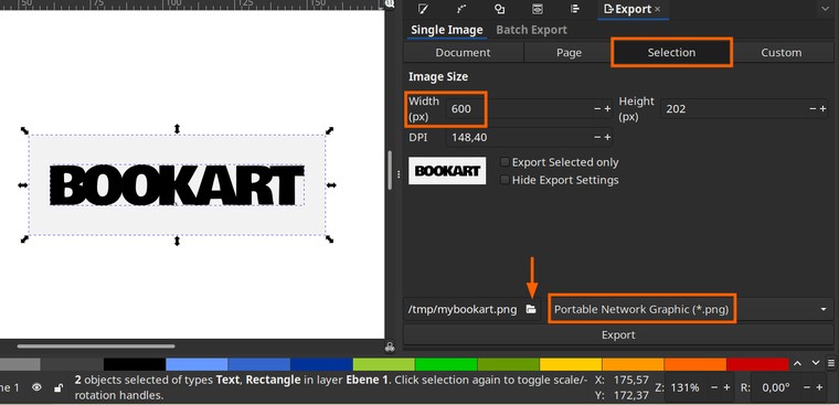
Now you need to get your word art out of Inkscape, to use it with the Bookart Generator. The Generator does not understand Inkscape’s file format (which is called SVG, and can be used almost everywhere else), but it does understand the PNG file format. Inkscape allows you to export your drawings to PNG, so that is what you need to do now.
- Select your rectangle (if it is still selected, which is indicated by it having a small dashed rectangular border, you don’t need to do anything), by clicking on it with the selection tool (the tool at the top of the tool box).
- Open the export dialog with
File > Export. - Make sure the third tab labelled
Selectionis active, and that the file format dropdown at the bottom showsPortable Network Graphic (*.png). - Set a width for your drawing in the width box below the heading
Image size. Something around 500 to 800 pixels should be good. The number should be at least as high as the number of sheets in your book. Do not touch the other number entry fields. - Select a file name and location by clicking on the little folder icon behind the file name (where the arrow points in the screenshot).
- In the dialog that pops up now, just click on ‘OK’.
Step #9: Generate the pattern, and fold!
Now all you need to do is visit the book folding pattern generator page, fill in all the required fields, create your pattern - and of course, fold.
This work is licensed under the Creative Commons Attribution-ShareAlike 4.0 License. You may share and adapt the contents, as long as you publish the result under the same license and give appropriate credit.

Comments ⚓
Be the first to write a comment!